This is all my own work, various commercial copyrights apply.
I'm an experienced senior Creative leveraging a broad skill set to deliver high quality 2 & 3D assets for print and screen. I'm interested in education and training, games, book illustration, effective UX, designing super efficient workflows... and cake :)
Please feel free to get in touch if you'd like a chat.
Contact: info@runninghead.com
Contact: info@runninghead.com
My experience with both web and print design affords me a rare perspective on creative projects, encompassing everything from liaising with clients and wireframing the UX designs to coding, graphics, animation, aligned email & print marketing and even copywriting.
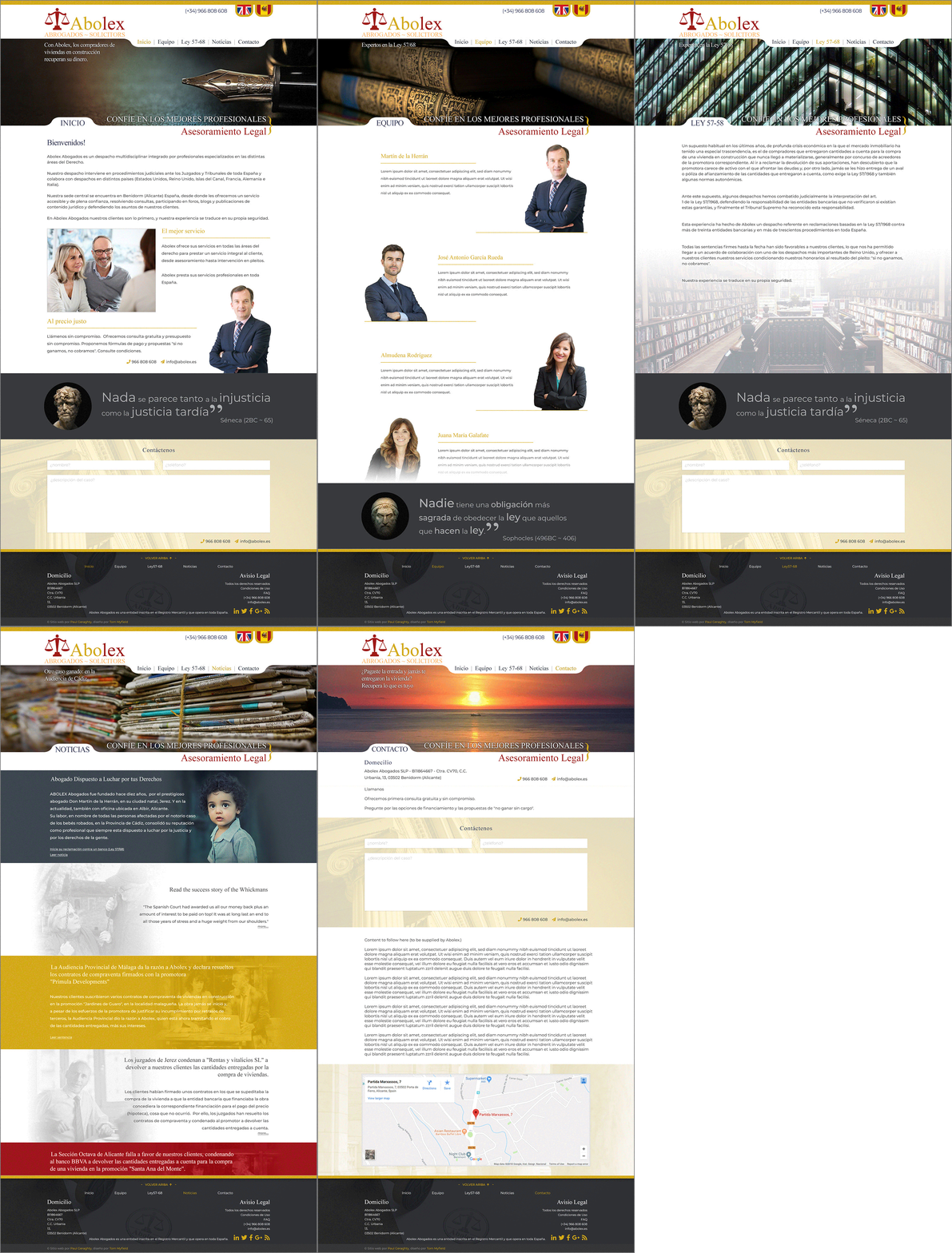
Below Left: Site Design for Spanish law firm Abolex. I created this design as a mockup PSD, using Layer Comps for efficiency, at 1920px wide in 12 column (CSS & Bootstrap-friendly) format, to give our Ruby Contractor an easier job.
The client was Spanish so I designed it in Spanish and was careful to make it "smart & professional" but still appeal to contemporary Spanish tastes. At the same time I took care not to present anything too different from the firm's existing brand. Existing brand colours maintained throughout.
My favourite page is the "mobile first" looking one "News/Noticias". The serious child photo is there for a good reason. Martin, the senior player of this firm made his name in Spain for prosecuting, pro bono, multiple cases of child kidnappings in a region where they were rife at the time. He's a legend but nowhere in their existing marketing was it referred to. Modesty's great of course but part of my job was to promote the firm so I tracked down the records, wrote some copy and added it to the design.
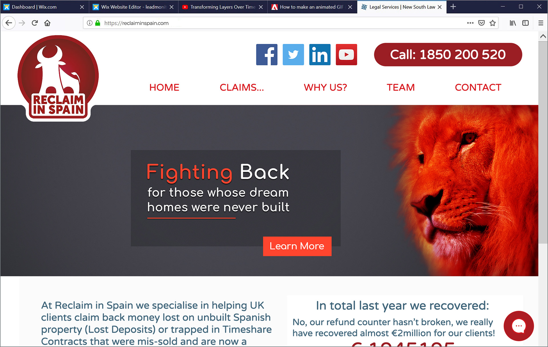
Below Right: Responsive banner design for CMC Reclaim in Spain.

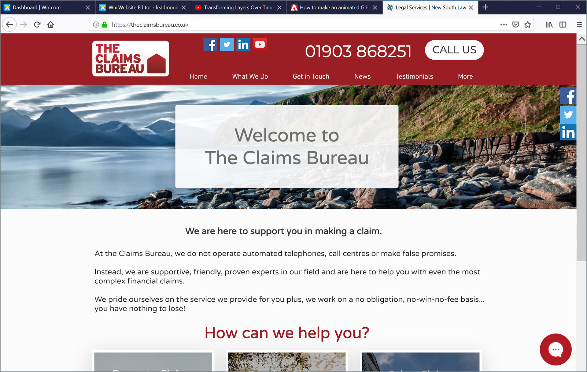
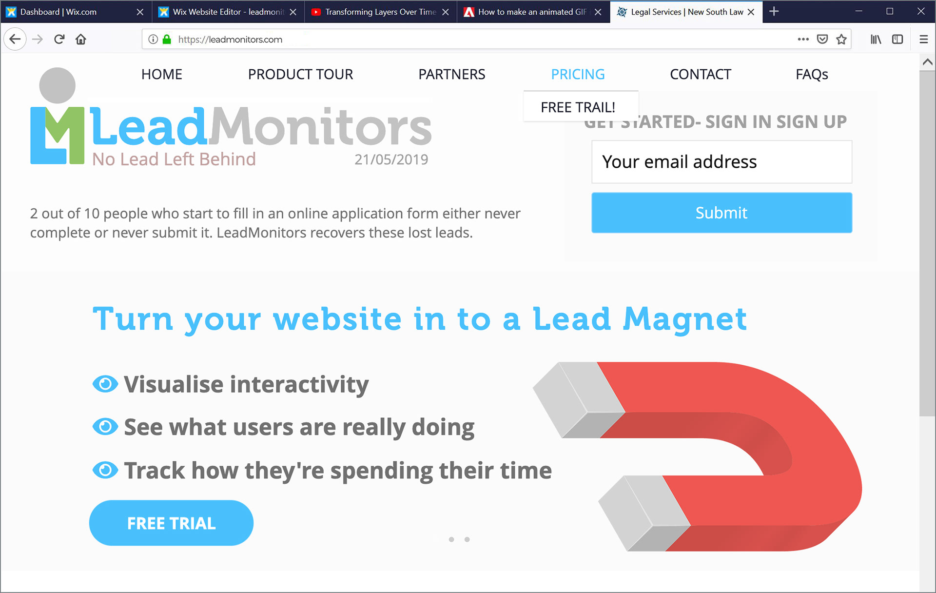
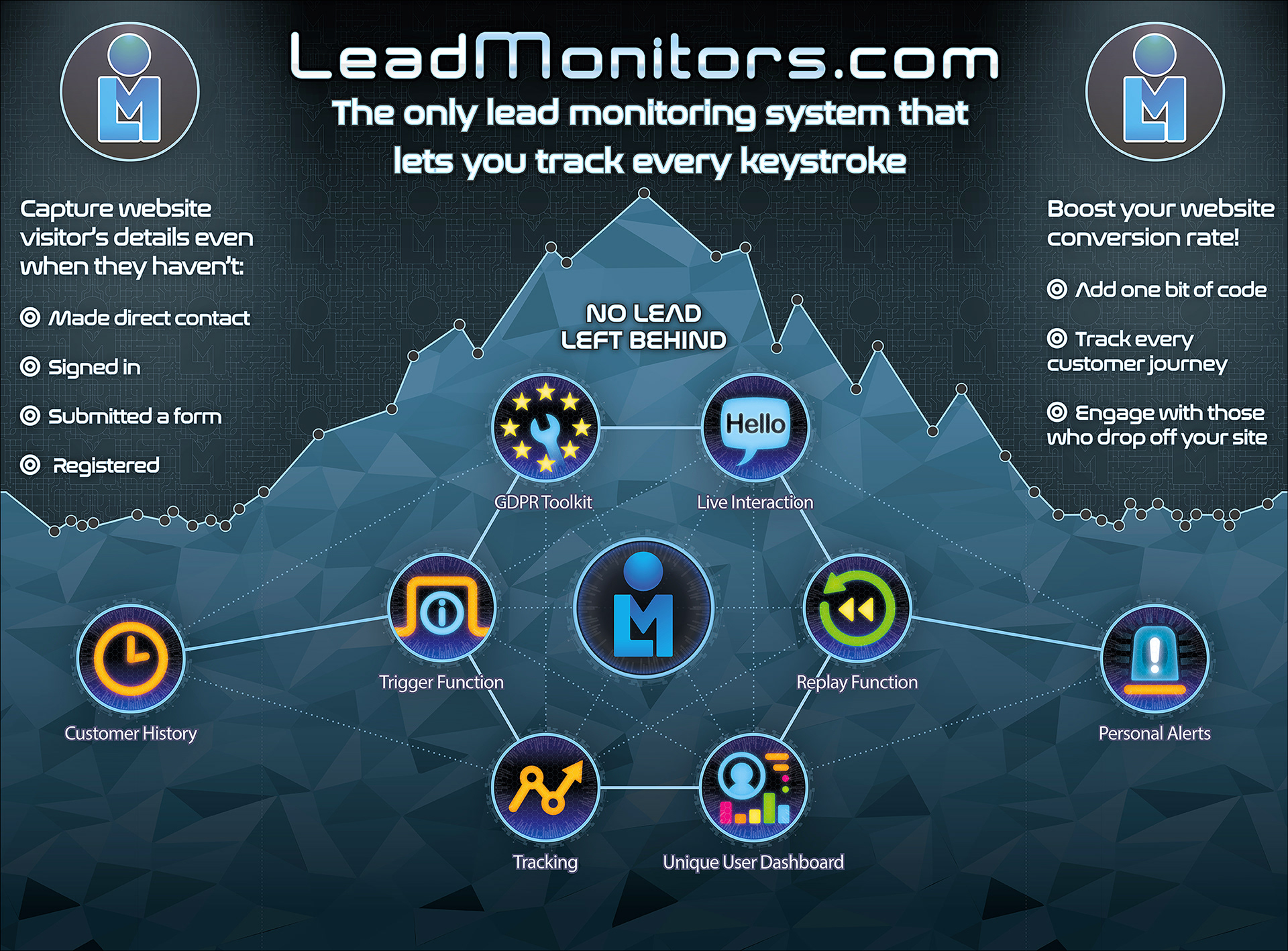
Sites I've made for Reclaim in Spain, The Claims Bureau, New South Law and LeadMonitors.

You can see sites I've either taken on, worked on or built entirely from scratch by using these links:
https://reclaiminspain.com/ (WordPress live site, took it on, rebuilt it in WordPress, as much as possible)
https://tommyfield.wixsite.com/reclaiminspain-copy (My WiX remake, dynamically providing both .ie and .com versions)
https://www.theclaimsbureau.co.uk/ (Live site, minor recent amends by others)
https://www.newsouthlaw.co.uk/ (Live site, minor recent amends by others
https://tommyfield.wixsite.com/leadmonitors-copy (A site I'm building for LeadMonitors, 80% done)
While I've plenty of training and professional experience creating websites by hand coding in HTML, CSS, Javascript and Php, most companies really seem to require "brochure" sites with limited back-end functionality and solid, if basic, SEO. To this end I've recently used mainly WordPress and WiX (WiX now being the most effective platform) though plenty of coding and a thorough understanding of UX design are still essential to this kind of work.
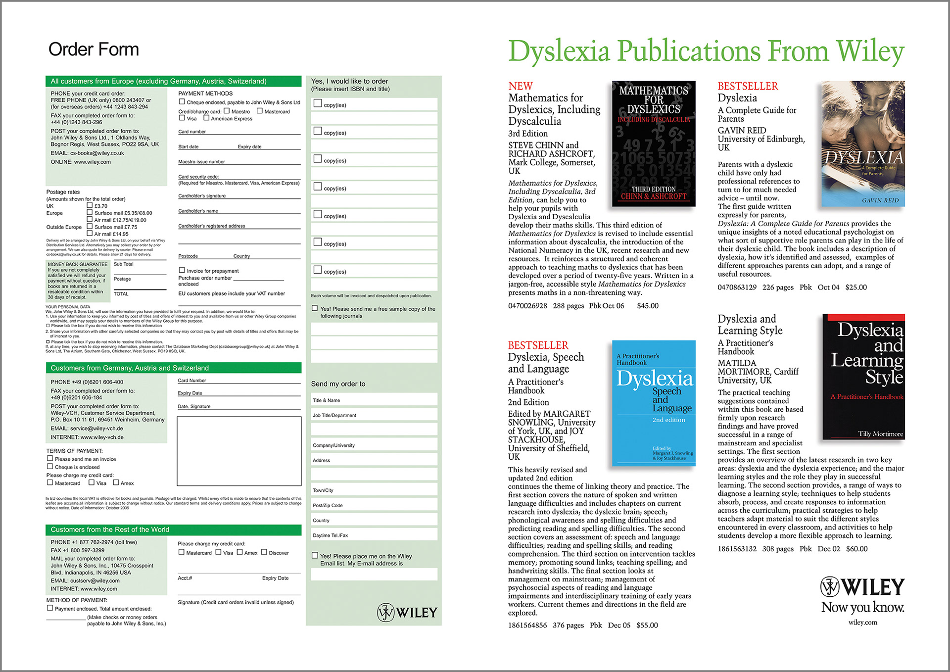
I take pride in creating forms that both look good and work perfectly. There's a lot to consider in form design but the best forms are the product of a balance between the needs of the company and the needs of the public, and the rigorous application of logic, of course :)
Logo Design







Print and web ident work for fine art blacksmith Dyed Wynn Jones.


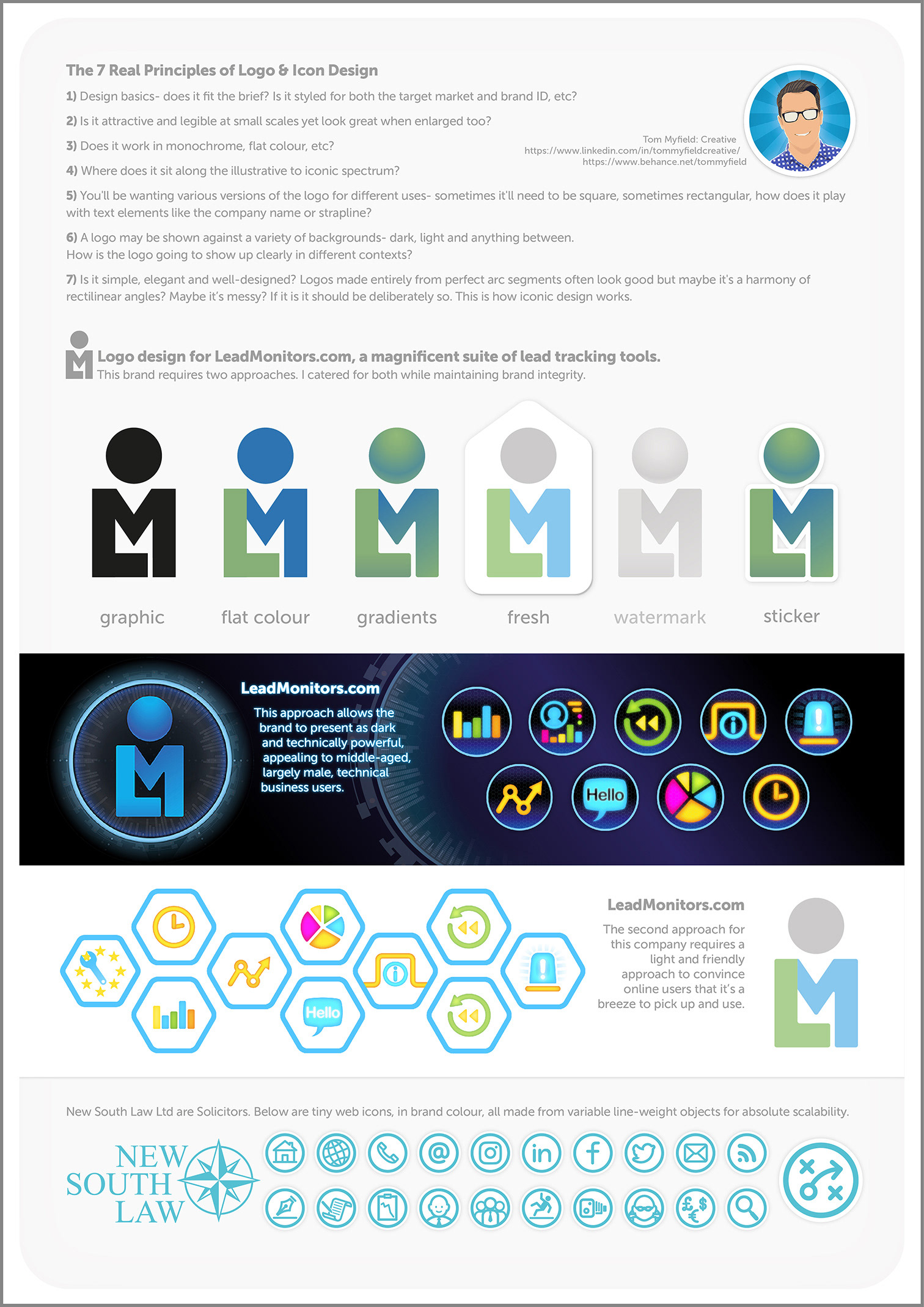
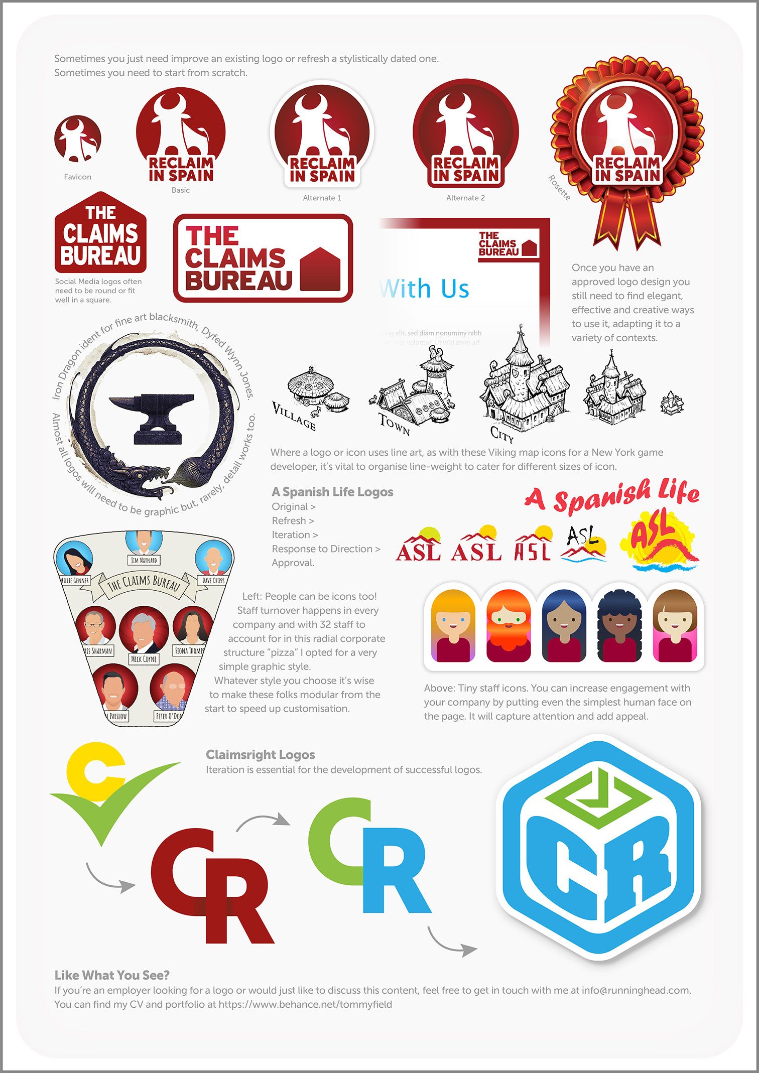
Logo and icon designs. Two pages. Designed primarily to showcase my grasp of logos & icon creation more than the work itself because I believe a thorough understanding of these design principles is vital to the production of assets that don't just look good but function effectively too.
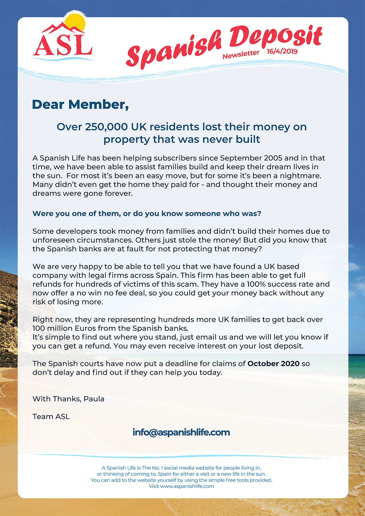
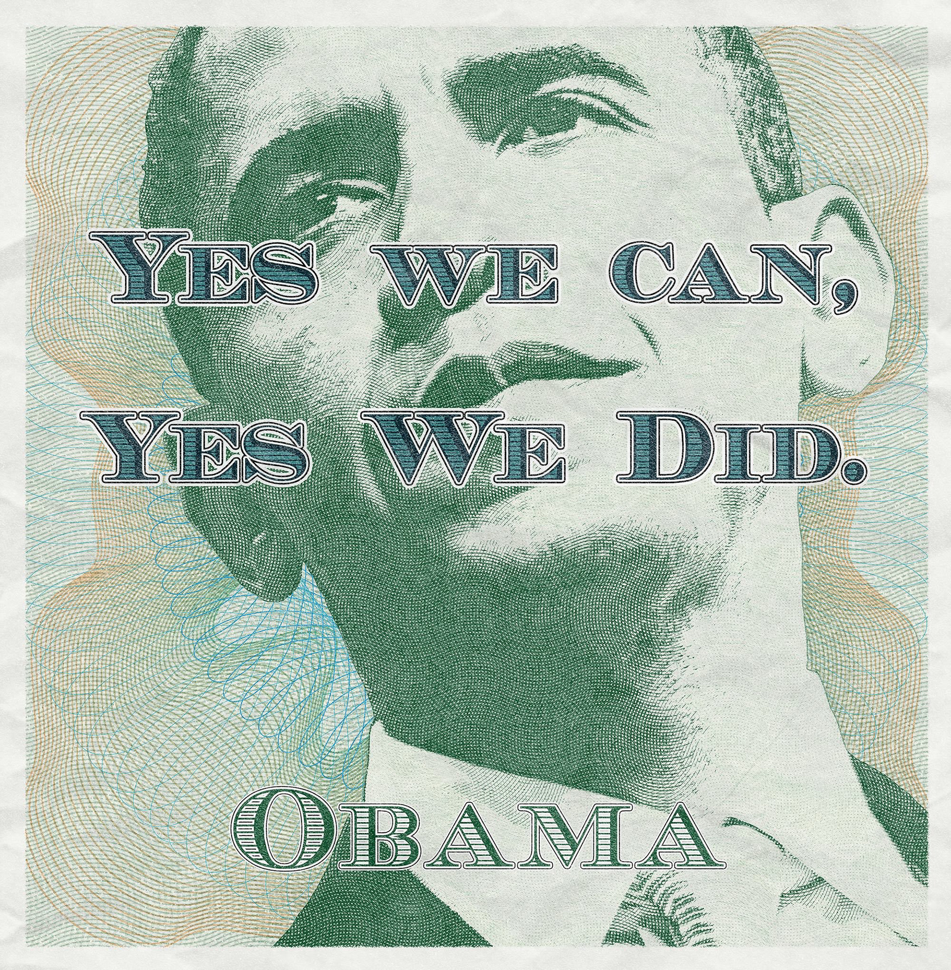
Design for print.
Huge "Curvorama" POS for LeadMonitors and Reclaim in Spain.



Book covers for educational publishers.
Two academic book covers for publisher CGP and one of the many covers I created for the successful "Shakespeare Made Easy" series from NelsonThornes/Wolters Kluwer. This series had the original text on every left page and a modern translation on every right.
The client wanted covers with the "impact of a DVD cover". Initially I'd pitched a couple of concepts more like movie posters but, with a very limited budget available, I suggested taking a single, iconic object from each play as the focus. I also designed all the other first edition covers for the series. The title font used is called "Macbeth" and the dagger was rendered in Cinema4D with processing, background illustration and layout in Photoshop and InDesign.
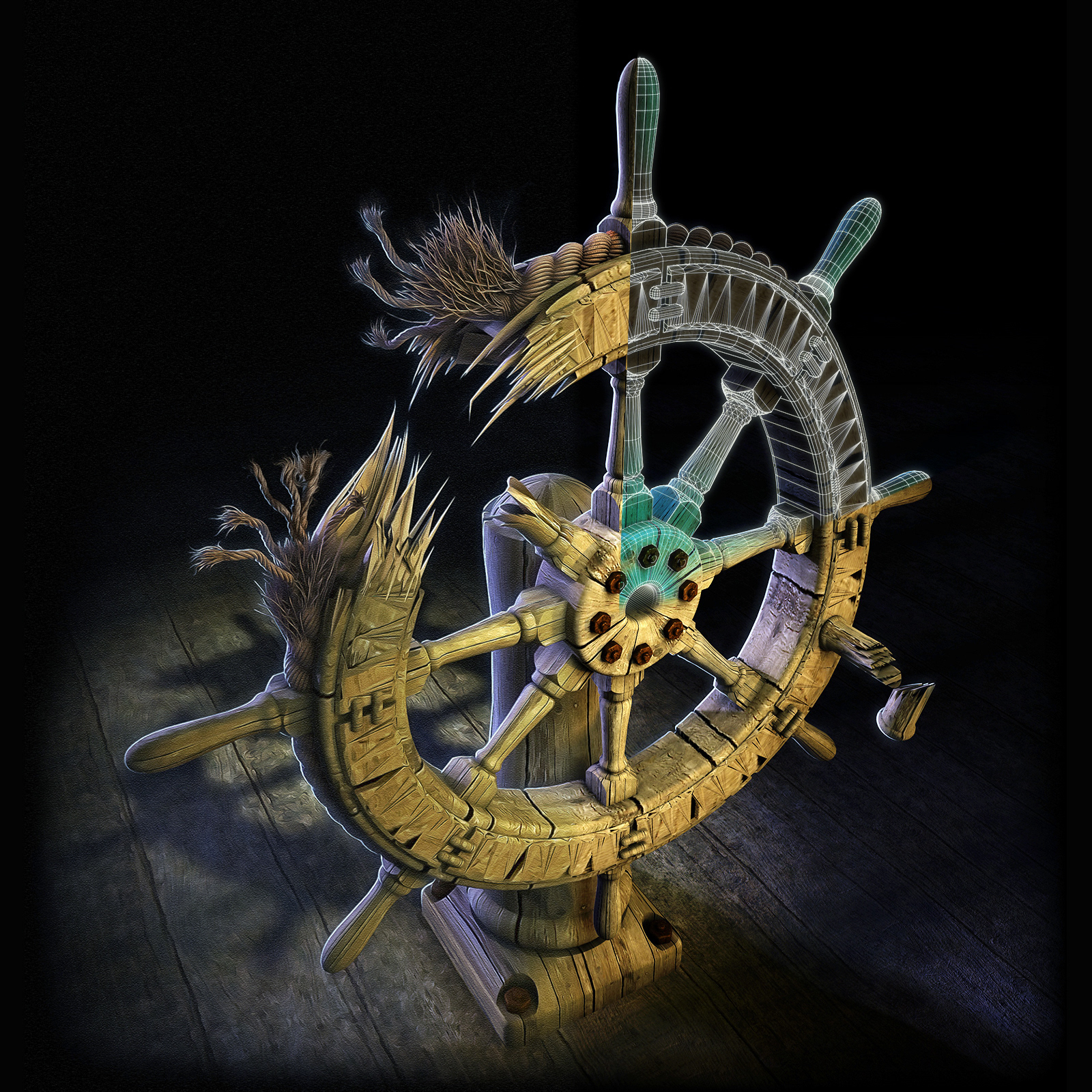
The last illustration, "The Tempest", shows a "process reveal". With just a few post-processing tricks and some very minimal illustration I can move my 3D renders away from that "computer generated" look and towards something more hand-illustrated.
The last illustration, "The Tempest", shows a "process reveal". With just a few post-processing tricks and some very minimal illustration I can move my 3D renders away from that "computer generated" look and towards something more hand-illustrated.

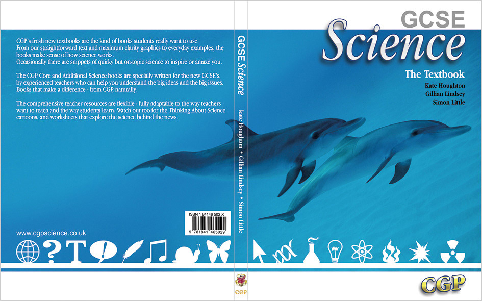
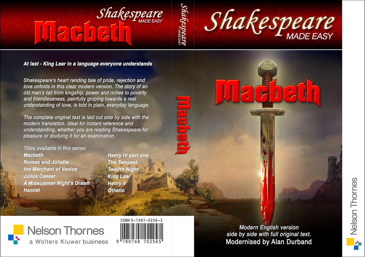
One on many covers for the successful "Shakespeare Made Easy" series from NelsonThornes/Wolters Kluwer.
A small selection from my Disney Star Wars tm product designs. I both designed the products and produced the artwork. It's a dark art getting 2D graphics to wrap around 3D geometry when the 3D bit is actually flat cloth- hard to explain and even more difficult to get right! Great when you see it on sale though.
Below: Just some of the brands I've been fortunate to produce work for.